Wednesday, November 11, 2015

Real Estate Analysis

Introduction

Through the process of real estate analysis, this report will attempt to "sell" a home (currently listed for sale) in the Third Ward neighborhood in Eau Claire, WI as well as determine its fair-market value. Additionally, it will identify a "target consumer" prototype in order to understand the market for this particular home.

In order to make these determinations, this report examines;
  • the unique features of the home
  • the location of the home (in the Third Ward neighborhood) within the context of the surrounding area
  • future development affecting the value of the home
  • a comparison of the home to other houses for sale or recently sold in the Third Ward
Data pertaining to homes for sale, the Third Ward Neighborhood, and surrounding regions comes from Zillow, the City of Eau Claire Comprehensive Plan 2015, and FindtheHome.com.


1524 Frederic Street

  • 4 Beds ~ 4 Baths
  • 3,398 sq. ft.
  • Built: 1928
  • Lot: 6,969 sq. ft. 

 Basic Features
  • Fireplace
  • Flooring: Hardwood, Tile
  • Finished Basement, 600 sq. ft. 
  • Detached Garage, 1 Space


Nestled deep in the quiet, cozy, historic Third Ward Neighborhood (see Figure 1) between downtown Eau Claire and the University of Wisconsin - Eau Claire campus, this expansive home at 1524 Frederic Street offers a high level of comfort amenities, accompanied by a degree of safety and prestige unparalleled in the city of Eau Claire. 


Figure 1: The home at 1524 Frederic Street within the historic Third Ward neighborhood in the heart of Eau Claire, WI


Unique Features

Making this home stand out, 1524 Frederic Street additionally features:


  • An ideal 16 x 23 ft. loft above detached garage
  • Cedar-shake siding
  • Picturesque Porch
  • Master Bedroom and Bath
  • Dramatic use of windows
  • Extensive Renovations
    • Electrical
    • Plumbing
    • HVAC
    • Roof
This home, built in 1928, possesses character and style newer
homes simply cannot match while also featuring essential 
updates ensuring this house matches modern homes in both quality, longevity, and future value.

Third Ward Neighborhood

Location

The historic Third Ward neighborhood is ideally positioned within the city in terms of access (see Figure 2). Surrounded to the east and south by a high ridge and, at the base of the ridge by the scenic Putnam Trail, this neighborhood possesses an element of solitude. 

On the other hand, with the bustling UWEC Campus to the west (census tract 17) and the re-energized central business district to the northwest (census tract 11.01), it retains a position near the cultural and intellectual heart of the city (see Figure 2). 

Figure 2: The Third Ward neighborhood is part of Census Tract 17
Source: Eau Claire Comprehensive Plan 2015

Housing Stock

Comparing the housing stock in the Third Ward Neighborhood Census Tract to others in the city of Eau Claire reveals that it possesses the oldest overall housing stock in the city with the smallest percentage of houses built after 1970 and, consequently, the largest precentage of houses built pre-1970 (see Figure 3). 

Figure 3: Percentage of Housing Stock per Census Tract in Eau Claire  based on the year the home was built
Source: Eau Claire Comprehensive Plan 2015

While the housing stock in the third ward is the oldest in the city, the homes in the part of the Third Ward neighborhood where 1524 Frederic Street is found possesses exclusively between 0 - 2 defects (see Figure 4), among the lowest in the city. Measuring this neighborhood with the more college-student inhabited portion to the northwest would paint an entirely different picture. However, the high quality of the homes surrounding 1524 Frederic Street is very apparent. 

Figure 4: Average of Number of Defects in homes in the city of Eau Claire
Source: Eau Claire Comprehensive Plan 2015

The impeccable quality of the homes likely contributes to the Third Ward neighborhood possessing the highest percentage of houses valued at $150,000 + by a considerable margin (see Figure 4). This is despite Census Tract 17 also including an area of extensive college rental units. Therefore, the area around 1524 Frederic Street likely contains almost exclusively homes exceeding $150,000 in estimated value. 

Figure 5: Value of Owner Occupied Housing Percentages by Census Tract for the city of Eau Claire
Source: City of Eau Claire Comprehensive Plan 2015

As noted earlier within this section, the Third Ward Neighborhood also includes college rentals, and thus college-age students. Using ESRI Tapestry Segmentation to gain a better understanding of this neighborhood would appear to contradict the data presented thus far. It indicates that the Third Ward falls 100% into the 'College Town' tapestry defined by non-family households, low-rent apartments, and people with limited income (see Figure 6).
Figure 6: ESRI Tapestry Segmentation indicates that the Third Ward neighborhood is 100% College Town

Further data dispels this notion, showing that, while the rental percentage is just above 50%, this leaves another 48% approx. of single family homes (see Figure 7). 


Figure 7: Percentage of Rental Occupied Housing by Census Tract in the city of Eau Claire
Source: City of Eau Claire Comprehensive Plan 2015

At first glance, this percentage might be enough to detract some people from this area a closer look reveals two completely different sections within the Third Ward neighborhood. The pattern of land use shows that the college rentals are located to the north and west while the south and east remains exclusively single-family residential (see Figure 8). 

Figure 8: Pattern of land use in the Third Ward Neighborhood of Eau Claire, WI
Source: City of Eau Claire Comprehensive Plan 2015

Demographics

Taking a look at the people who reside in the Third Ward Neighborhood, the expected high percentage of college students is found (39.42%). However, and notably, the second-largest age group in the Third Ward is children and teenagers indicating that there are a large number of families living in houses such as 1524 Frederic Street in the more exclusively single-family residential section. 

Figure 9: Age Distribution of Third Ward Residents compared to larger surrounding regions
Source: Findthehome.com

Taking a look at annual income, the college student population influence gives the Third Ward a higher percentage of residents below $25,000 than the surrounding city, county, state, and country (see Figure 10). However, tied to the approx. 40% of single-family residential homes in the neighborhood, 40% of residents have an annual income above $50,000. It is safe to conclude that most single-family residential homes in the area are occupied by people with this income or higher.

Figure 10: Annual Income of Third Ward Residents compared to larger surrounding regions
Source: Findthehome.com

Important to note, the Third Ward neighborhood possesses significantly higher percentages of people with graduate degrees compared to surrounding regions (see Figure 11). This reflects both the proximity to UWEC as well as the quality of the homes attracting people with white-collar jobs reflecting their high level of education. 
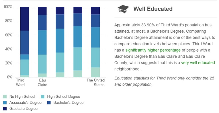

Figure 11: Highest Degree Attained for Third Ward Residents compared to larger surrounding regions 
Source: Findthehome.com

The commute times for residents in the Third Ward, noticeably lower than the larger surrounding regions (see Figure 12). also suggest that this region has a high level of access. Access possesses value, and professional residents of this neighborhood can afford to pay for it. 

Figure 12: Commute Length for Third Ward residents compared to the larger surrounding regions
Source: Findthehome.com

Future Development

The area around the Third Ward including the central business district of downtown Eau Claire is growing exponentially with many recently completed projects such as Phoenix Park, new major business additions like JAMF Software and RCU Corporate, and new high-end apartments. Not only that, but there are several future developments that bode well for the value of the Third Ward Neigborhood. These include the just-approved Fine Arts Center as part of the Confluence Project currently underway (see Figure 13), the UWEC Event Center and YMCA Tennis Center locating across the street from each other on Menomonie Street (see Figures 14 and 15), and the conceptual Cannery District redevelopment (see Figure 16) potentially featuring a public market as well as two new brew pubs already in place. All of these additions are located within two miles of the Third Ward neighborhood.

Figure 13: Confluence Project consisting of Fine Arts Center and Mixed-Use Development Property

Figure 14: UWEC Events Center conceptual design

Figure 15: YMCA Tennis Center conceptual design

Figure 16: Cannery District conceptual design

Housing Comparison

Two houses in the Third Ward sold in 2015 are comparable to 1524 Frederic Street. These homes at 1718 Frederic Street and 334 Lincoln Avenue both feature four bedrooms, more than two baths and two-car garages. In addition, they are all fairly similar when it comes to square footage (see Figure 17). 

Both homes sold for $240,000 setting a baseline for the sale of 1524 Frederic Street. The home at 1718 Frederic Street sold below its Zillow estimate (likely valued higher due to being built in 1975) while 334 Lincoln Street sold very close to its estimate. 

The one thing potentially impacting 1524 Frederic Street in a comparison to these homes is lot size. This is a large determinant of property value especially in an high-end, established neighborhood with limited or no growth potential. Still, 1524 Frederic Street received a Zillow estimate between $40,000 to $70,000 lower than the comparison properties. The additional difference appears to be a reflection that Zillow has not taken into account the extensive renovations done on the property. 

Figure 17: A comparison of two houses similar to 1524 Frederic Street that were sold in 2015

An additional comparison to homes currently for sale in the Third Ward reveals that 1524 Frederic Street is ideally suited to take advantage of the housing market.  Three other relatively similar homes in number of bedrooms and bathrooms. as well as square footage all are priced in $10,000 increments above its current asking price. Lot size appears to be the main differentiating factor for the other three comparison houses which helps place 1524 Frederic Street at or below them in value. The Zestimate differentials between the homes is exorbitant but this seems to be an aberration negatively reflecting on the home.

Figure 18: A comparison of three houses similar to 1524 Frederic Street that are currently for sale

Conclusion

Based on overall quality, the strong set of amenities offered, an ideal location of 1524 Frederic Street in the heart of the historic Third Ward district, and demographics pointing to high income and professional occupations, the following target market is recommended.

Target Market

  • Families with children
  • Annual Income >$75,000
  • White collar work force reflecting graduate/professional/doctorate degrees
  • Progressive, community-oriented people

Suggested Sale Price

In addition to the above-mentioned characteristics of the home and the neighborhood setting, this home has a window for sale between $240,000 (from the price of similar homes recently sold) and $279,000 (based on the prices of slightly better homes for sale in the Third Ward). 

By sliding in just underneath the prices of this better homes, they will be able to attract potential home-buyers who do not see a great deal of difference between these homes for sale in the Third Ward. While the value of the home may actually be closer to the homes recently sold at $240,000 the market allows this home to be priced at:                                                                                                                                                                        $258,900


Tuesday, October 6, 2015

Study Areas, Geocoding, Customers, and Trade Areas

Introduction

This report has been developed for two (separate) coffee and doughnut shops located in San Francisco who are seeking to maximize their trade areas without entering into direct competition with one another.

Within their overall goal, the store owners have identified five questions they would like answered:
  • What is the market like for both stores?
  • Who are the store owners' core customers?
  • Are they competing for the same customers?
  • Is one store in a better position than the other?
  • Where are their competitors located?
In order to reach this goal, the following data will be presented:
  • current customer locations relative to both store locations
  • competitor locations
  • customer-derived trade areas
  • demographic data on current customers based on customer-derived trade areas
  • walk-time trade areas
After presenting this data, conclusions and recommendations will be provided for each business in order to guide their decision-making process as they seek to maximize their trade areas while avoiding direction competition with one another.

Customer Locations

Customer addresses provided by each of the coffee and doughnut shops show the tight concentration of customers around each shop. This falls in line with the store owners' impression that a significant portion of their business comes from customers who walk.

Store 1

Store 1, to the north (see Figure 1), shows the heaviest concentration in a 3 x 4 block (square) area surrounding the shop. There is small contingent of customers extending further east into and spread throughout Chinatown.

Also, Geary Boulevard seems to pull customers from further west in the Richmond District and even down into the Sunset District.

Store 2

The heaviest concentration of customers for Store 2 are not encapsulated as the customers for Store 1, due in great part to the lack of a similar grid-like structure to surrounding streets (see Figure 1). The slightly more elongated pattern stretches tightly southwest into Bayshore while reaching out more broadly north into the Mission District and east into the west edge of Ingleside. 

In addition to the proximity patterns, the linkage between the Lames Lick Freeway and Highway 280 pulls some customers from the northeast and even the Bayview District. Similarly, the linkage between CA-1 and Highway 280 appears to pull some customers from throughout the Sunset District. 
Figure 1: Coffee and Doughnut Shop Customer Locations for two stores in question in San Francisco

Competitor Locations

Clearly, San Francisco is not lacking for competition in the coffee and doughnut shop market. Coffee and doughnut shops can be found in various concentrations throughout the study area. This includes stores almost on top of the two store-owner locations.
The most heavy concentration centers in Chinatown directly east of Store 1. This concentration pattern spreads from Chinatown to the southwest into the Mission District ending, generally, north of Clipper Street with  Store 2 further to the southeast.
Generally speaking, Store 1 (to the north) faces much heavier competition in the area directly around their location when compared to Store 2. 
Figure 2: Coffee and Doughnut Shop Competitors throughout San Francisco

Customer-Derived Trade Areas

Business Analyst, a program developed by ESRI and implemented using ArcMap software allows for the creation of customer-derived trade areas. The rings produced using this method indicate the area containing 40%, 60% and 80% of a store's customers.

Using this method of analysis, Store 1 derives its customers at each percentage interval over a significantly smaller, more compact land area than does Store 2. Particular shapes for each ring appear to reflect the location of parks, major roads and other features.

Noticeably, the concentration of coffee and doughnut shops witnessed in Figure 2 appears to influence the 80% ring for both stores. This concentration likely detracts each store from pulling customers in larger percentages from the northeast Mission District and Chinatown. 
 Figure 3: Customer-derived trade areas for both coffee and donut shops under analysis

Demographic Data

Based on the customer-derived trade areas developed (see previous section), Business Analyst ESRI software produces a Community Profile report and a report entitled Retail Goods and Services Expenditures. These will be used to develop a picture of the clientele for each store.

In addition to more typical data about population such as population age, home ownership vs. renters, and purchasing habits, Business Analyst develops a picture of residents of a certain area by breaking them into tapestry segments intending to capture many features of the population into groups based on these features. These tapestry segments are provided for the three customer-derived trade area groupings for the areas where 40%, 60%, and 80% of a store's customers are located within. Information about spending patterns, median age, and median household income are provided within each segment description.

Store 1

The top tapestry segment for each customer-derived trade area for Store 1 is entitled 'Laptops and Lattes' (see Figure 4). While this segment represents a noticeably strong 32% of Store 1's customers in the area where 40 percent of it's customers reside, this percentage continue to strengthen (to above 40%) as you move into the 60 and 80 percent areas. 


Figure 4: Laptops and Lattes tapestry segment

In addition to this predominant segmentation, two other segments follow in-step. The 'Trendsetters' segment (see Figure 2) represents between 20% - 25% of Store 1's customers in each customer derived trade area while 'Metro Renters' (see Figure 3) follows with between 15% - 20% of customers.


         Figure 5: Metro Renters tapestry segment                     Figure 6: Trendsetters tapestry segment

Using data provided for each of these tapestry segments, approximately 80% of the people living in store 1's customer derived trade areas are between 30 and 40 years old. They also have a tendency to stay connected through social media sites and their cell phone and are prone to utilize public transportation, bike or walk. 

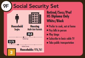
Two other segments appear most often in Store 1's tapestry segments and appear to diverge from the predominant theme developed thus far. Both the 'Social Security Set' (see Figure 7) and 'Retirement Communities' (see Figure 8) figure into their customer derived trade area with the former representing anywhere from 8 - 15% of the population throughout and the latter representing 7% - 14% of the population in the 40% and 60% customer derived trade areas. 

            Figure 7: Social Security Set tapestry segment                       Figure 8: Retirement Communities tapestry segment

These populations are older with median ages between approx. 45-50 years, considerably less income, and tend to cook at home more. 

As a whole, each tapestry segment noted here is defined by singles living in multi-unit rentals as opposed to married couples living in single-family homes.

Looking at the Retail Goods and Services Report shows that residents in the customer-derived trade areas spend $4,000 - $5,000 on food outside of the home (see Figure 9). 


Figure 9: Money Spent on Food Away from Home per year by Customer-Derived Trade Area

Taking a look at where the population is headed from 2010 to 2020, the Community Profile report projects steady numbers for all population categories between 15 and 64 years (in ten-year increments) other than a steadily decreasing 15-24 year-old population both by 2015 and again by 2020. The 25- 34 year-old population segment is noticeably the strongest representing approximately 25% of the population in each customer-derived trade area throughout the projection window. A drop-off in population into the mid-teen percentages occurs for the 35-44 and 45-54 year-old age cohorts. this is followed by another noticeable drop-off to around 10% for the 55-64 year-old cohort.However, these numbers are not declining throughout the decade; rather they hold steady in each age cohort.

Store 2

The tapestry segment that makes up the greatest percentage of the population for Store 2 is 'Urban Chic' (see Figure 10). It makes up the largest percentage of both the 40% and 60% customer-derived trade areas at just above 25% of the population and falls to third at just above 15% of the population in the 80% trade area.

The Pacific Heights tapestry segment (see Figure 11) runs a close second representing around 20 - 25% of the population in all three customer-derived trade areas

          Figure 10: Urban Chic tapestry segment                          Figure 11: Pacific Heights tapestry segment

These two tapestry segments have a median age between 40 and 45 years old with a median income of $75,000 - $100,000. They appear to be more focused on automobile ownership, investments, and various forms of entertainment. There also is an indication they may prefer online shopping. 

As you move further away from Store 2 (by trade area), the 'Laptop and Lattes' segment (see Figure 12) becomes more and more influential increasing from 11.5% to 21.5% and again to 25.10% in the 80% customer-derived trade area where it is the most prominent tapestry segment.


Figure 12: Laptop and Lattes tapestry segment

The third grouping of note within the tapestry segments belongs to both 'City Lights' (see Figure 13) and 'Downtown Melting Pot' (see Figure 14). These segments are typically between 35 and 40 years old with median income between $45,000 and $65,000. They appear to be noted for frugality and utilize the internet for banking and entertainment. Interestingly, they are both noted for various forms of involvement with the lottery.

       Figure 13: City Lights tapestry segment                       Figure 14: Downtown Melting Pot tapestry segment

Overall, each tapestry segment noted for Store 2 is defined by married-couple households living in anything ranging from single-family homes (the most prominent) to multi-unit homes to high-density apartments.

The Retail Goods and Services report shows that residents living in the three customer-derived trade areas for Store 2 spend roughly between $5,000 and $5,500 on food away from home per year (see Figure 15). 


Figure 15:  Money Spent on Food Away from Home per year by Customer-Derived Trade Area

An overview of where the population is headed from 2010 to 2020 shows similar percentages holding steady in the mid-teens for each 10-year cohort from 25-64 years old. The 15-24 continues to hover around 10% of the population throughout the decade. 

Walk-Time Trade Analysis

Walk-time trade analysis indicates the areas that are within . 5, 1 and 1.5 mile layers around each location. As a result, barring specific obstacles impeding walking, similar walk time areas should be produced for each store. While the exact shapes for each store are different, this is ultimately due to the shape of the streets surrounding. That being said, the overall area covered appears similar for each store.  

Store 1

A very square shape develops around Store 1 with the longest reaches falling along the streets moving directly north, south, east, and west. This pattern fits with the more uniform grid pattern of streets surrounding the shop. 

Store 2

The irregular street pattern around Store 2 leads to similarly irregular walk-time areas. The pattern is longer and thinner with a slight northeast to southwest tendency. The pattern is lengthened the most along main streets proceeding directly from the store in a similar fashion.
Figure 4: Walk-Time areas for both coffee and doughnut shops under analysis

Discussion

 Store 1

Customer Location and Competition

Store 1 possesses a much more compact customer base for a couple of reasons. First, there is significantly more competition on the northeast of San Francisco. Second, the pattern of living is typically muti-unit to high-density apartments. this allows coffee shops to exist, potentially even on the same block while still wielding influence over an area with a high population. 

As a result, the customer-derived trade areas for Store 1 tend to be similarly tight and compact around the store only beginning to differentiate in shape in the '80% of customers' trade area. Where it is able to branch out a little bit is in areas that move away from the higher concentration of coffee shops to the east and southeast.

Demographics

The customer base for Store 1 is heavily influenced by a 25-34 year-old population segment consisting mainly of single households as opposed to married couples. The strongest sub-set of this category possesses a median income of above $100,000  while the remaining segment has a median income of around $50,000. 

Importantly, each of these segments appear inclined to utilize public transportation, walking and biking while also exhibiting a strong proclivity for connection by cell phone and through social media. As a result, they tend to fit the general personality of people thought to frequent coffee shops in a downtown setting. 

While the remaining population segments tend to fall into older age-cohorts, they are, notably, still mainly single households. This segment of the population has increasingly been attracted to downtown living now that children have moved out of the house and there are less responsibilities. As such, this segment may further buoy rather than detract from the more dominant young, single population around them.

The Retail Goods and Services report indicating how much these populations spend outside of the home are somewhat inconclusive but also indicate that they spend less, on average, than do those living in the customer-derived trade areas around Store 2. 

Looking toward the future, the makeup of the customer base for Store 1 appears to hold steady throughout the next decade. the only element of minor concern is a steadily decreasing population of 15-24 year-olds. Still, with strong numbers throughout the other most relevant cohorts, this should be the source of little worry.

Store 2

Customer Location and Competition

Store 2, on average pulls 40, 60 and 80% of its customers from a larger area than does Store 1. There are a couple of factors influencing the customer-derived trade areas in this way. The streets are not grid-like as seen for Store 1, meaning it is likely less easy to reach Store 2. In addition, Store 2 appears to be located in a less dense area. They are located in an area with far more single family dwellings and fewer multi-family and high-density apartments. Therefore, there are fewer customers available to them in a given area. 

The pattern of larger customer-derived trade areas encompassing a given percentage of their customers also suggest their location may pull in more customers who drive compared to Store 1. This is reinforced by the tapestry segments for Store 2 that indicate their customer base utilizes public transportation, walking and biking less and invest more in vehicles. 

There is considerably less direct competition in the area immediately surrounding Store 2 which might suggest they are in a more enviable position. However, this may simply be due to the fact that they are in a less-dense area where people tend to be slightly more car-centric. 

Store 2's customer-derived trade area comes to an abrupt end when it reaches the area to the northeast of their location where coffee shops begin to be more concentrated whereas these trade areas continue on further in other directions where there isn't the same concentration of competition.

Demographics

Store 2 faces a customer base that is distinguished by married couples living in single-family homes. While the larger sub-segment of this group have median incomes from $85,000 - $10,000, approximately, they also see a relevant amount of married couples living in multi-family or high-density apartments while also having lower median incomes between $45,000 and $65,000.

Public transportation is not an important element for three out of the four tapestry segments composing the married couple element of Store 2's customer base, indicating vehicular transportation is in high use. 

There is far less of an overall indication that the entertainment practices employed by all four of these tapestry segments are as conducive to a typical coffee shop crowd. They tend to employ different forms of entertainment out-of the-house while also focusing on online connections that tend to practiced more at home than in a coffee shop setting. 

That being said, approximately 25% of Store 2's customer base consists of the highly desirable tapestry segment, 'Laptops and Lattes'. However, this segment of the population in their customer-derived trade area is more prominent in the outer rings. This suggests that Store 2 is located in a very family-oriented setting with many single households on the fringes of their trade area. This tapestry segment of the population likely helps Store 2 but is not strong enough to warrant more dense competition.

The Retail Goods and Services Report indicates that households tend to spend more on food outside of the home in Store 2's trade area than do households in Store 1's trade area. However, it could be argued this is due to the presence of more children for the 75% of the population that is married. 

Conclusion

Market and Core Customers

Store 1 has a strong setting in a prominently single household area featuring high density living where people walk, bike, and take public transportation and utilize their phones and social media for communication. 

Store 2 is located in a market defined by married family households with the largest segment consisting of single family households. Typical vehicle transportation tends  to be employed in their trade area. Internet connection tend to be of the variety that takes place in the home.

Customer Competition

The two stores are, largely not in competition for the same customers outside of the ideal 'Laptop and Lattes' tapestry segment seen in both trade areas. However, Store 2's customer base is 75% married families - they are largely not in direct competition. In addition transportation employed by customers for each store further differentiates them.

Position

Based on the analysis, despite the fact that Store faces much stiffer competition. There trade area is strongly and ideally suited to attracting customers. The outlook for the future indicates they will continue to hold the advantage of an ideal customer base. 

Store 2 is, by no means, in a bad location. However by indicating they appeal to traffic involving walking and biking, they may be out of position by being located in an area where there greatest appeal would be to those driving automobiles.

Competitors

Store 1 faces stiff competition typically to the east and southeast of their location while competition is less prominent in every other direction. 

Store 2 faces competition of the much more sparse variety in keeping with their location in single-family households with higher density living on the fringes. Thus, there is probably less direct competition for the variety of customer they appeal to - the walk-in crowd.

Monday, September 21, 2015

Population Dynamics

Introduction

In order to present a group of business partners and investors with details informing them about the business model to pursue in Colorado Springs, CO, this report will explore the population dynamics in the city as well as draw comparisons to the state of Colorado and the nation as a whole. In addition, information about the overall cultural and service sectors will be presented. 

Initial discussions between the business partners have identified the following potential market segment possibilities to focus on in the development of their new business:
  • a growing population of young children
  • retirees
  • Hispanic populations
Each of these segments will be explored further using these elements:
  • Population Pyramid
  • Dependency Ratio for the above stated market segments (city, county, state, nation)
  • Location Quotient
    • population market segments
    • service industries
After presenting this information, conclusions and recommendations will be provided addressing each potential market segment to inform the overall direction of business investment for the partners.\

Population Dynamics

2013 American Community Survey (ACS) 5-year estimate data provides the basis for the three methods of population dynamic analysis in Colorado Springs. First, a population pyramid will be used to explain the overall age/sex structure of the population in Colorado Springs. Second, dependency ratios will provide a comparison of both the youth and retired populations to the working population. Third, location quotients will reveal the concentration of the youth, retired, Hispanic, and White populations in comparison to El Paso County, the state of Colorado, and the United States, as a whole.

Age/Sex Structure

The following population pyramid breaks down the population of Colorado Spring into 5-year age cohorts from age 0 to 4 all the way to 85+ as well as providing information about the male/female distribution in each cohort.

Figure 1: The population pyramid for the city of Colorado Springs shows relatively consistent population numbers for all cohorts with a steady decrease after the 60 to 64 years cohort

Dependency Ratio

Two market segments identified by investors relate to age (youth and retired populations). A dependency ratio provides information about the total population in each of these larger cohorts in relation to the working age population. 

The following equation is used to determine the dependency ratio:

DR = 100 * (P0-14 + P65+) / P15-64

P0-14 = Population in the 0-14 age group, also known as the Youth Dependency Ratio (YDR)

P65+ = Population in the 65+ age group, also known as the Elderly Dependency Ratio (EDR)

P15-64 = Population in the 15 to 64 age group

Using the 2013 ACS Survey 5-year estimates, dependency ratios are developed for the city of Colorado Springs and the state as a whole.

Dependency Ratio (Colorado Springs) = 46.25%

The total number of those typically identified as dependents (0-14 years, 65+ years) is equivalent to 46.25% of the working-age population (15-64 years) in the city of Colorado Springs.

Dependency Ratio (Colorado) = 46.13%

The total number of those typically identified as dependents (0-14 years, 65+ years) is equivalent to 46.13% of the working-age population (15-64 years) in the state of Colorado.

Population Location Quotient

The location quotient measures the concentration of a particular variable in a geographic region in relation to the concentration in another geographic region. For the purpose of this report location quotients will be developed for the city of Colorado Springs, the surrounding county of El Paso, the state of Colorado, and the United States as a whole. 

LQ = 1: both geographic regions have the same concentration of a particular variable

LQ > 1: the region in question has a higher concentration of a particular variable than does the               comparison region

LQ < 1: the region in question has a lower concentration of a particular variable than does the                 comparison region

The graph below (see Figure 2) reveals the location data used for the city of Colorado Springs, the county of El Paso, the state of Colorado, and the United States to determine the location quotients for the population of residents 0-14 years, 65+ years, Hispanic, and White.

Figure 2: This graph provides the data used to determine location quotients for the three potential market segments identified by investors

Using the percentages calculated in Figure 2 for Colorado Springs divided by the percentages for the other regions of comparison yields the following location quotients (see Figure 3).

City of Colorado Springs Location Quotients

Figure 3: Location Quotients for the city of Colorado Springs show the concentration of the particular variables in question when compared to the surrounding county, state, and country

Service Industry Location Quotient

Using the same process for determining location quotients for population variables in Colorado Springs, the location quotients for service industries were calculated (see Figure 4) by comparing industry concentration to that of the state of Colorado. 

Figure 4: Location Quotients for service industries in Colorado Springs when compared to the state of Colorado

Conclusions

The investors/business partners have identified three market segments (youth (age 0-14), retired (age 65+), and the Hispanic population) they are interested in developing a business within the service industry category. The population pyramid, dependency ratios and location quotients provide insight about the current population dynamics in Colorado Springs for each segment.

Youth (Age 0-14)

Looking at the population pyramid for Colorado Springs (see Figure 1), reveals that the city is not exactly suffering, as some larger cities are, from low birthrates. In fact, the pyramid shows very consistent numbers in each age cohort up until age 64. So, at first glance, investors seem to be right about the market potential in this population segment.

If anything, the dependency ratios seem to reinforce this line of thinking. The ratio of dependents when compared to the working age population for Colorado Springs (46.25%) are slightly higher than the state of Colorado (46.13%), as a whole. It remains to be seen whether that is due to larger numbers in youth populations or in retired populations. 

The location quotients shed some light on this question by showing that, while Colorado Springs has a higher concentration of youth when compared to the United States (1.05) and Colorado(1.02), it actually has a lower concentration of youth when compared to the surrounding El Paso County (see Figure 3).

Retired (Age 65+)

The population pyramid for Colorado Springs (see Figure 1) does show the decrease in population in cohorts when residents reach typical retirement age, but this is a very normal pattern as people reach this stage of life. It may still be the case that Colorado Springs has a larger than average population of retired persons.

The dependency ratios show that Colorado Springs may have a larger population of retired persons than is seen when considering the state, overall. But, again, this variable considers youth under age 14, as well. 

Colorado Springs' location quotients paint a somewhat muddled picture (see Figure 3). Both the nation and the state have higher concentrations of retired persons than Colorado Springs. However, the city also has a higher concentration (1.06) than the surrounding El Paso County.

Hispanic Populations

Neither the population pyramid nor the dependency ratios are able to shed any light on the Hispanic population market segment. Relying solely on location quotients (see Figure 3), Colorado Springs has the same concentration as the United States (1.00), a lower concentration than the state of Colorado (.80), and a higher concentration than El Paso County (1.08). This LQ value represents the most significant concentration other than the concentration of white people compared to the entire United States (1.11).

Other areas in Colorado contain concentrations of Hispanic populations that dwarf the concentration seen in Colorado Springs, but within the surrounding county, Colorado Springs appears to be a focal point for Hispanic populations.

Service Industries

Location quotients for service industries (see Figure 4) when comparing Colorado Springs to the state of Colorado show that the Finance/Insurance/Real Estate industry may be over-saturated (1.03) while the Professional/Scientific/Management/Administrative/Waste Management industry is on par with the rest of the state. 

Four service industry categories are less concentrated in Colorado Springs than the state of Colorado: 
  • Education Services/Health Care/Social Assistance (.94)
  • Arts/Entertainment/Recreation/Accommodation/Food Services (.94)
  • Other Services (.82)
  • Public Administration (.78).

Findings and Discussion

Based on the conclusions above, all of the market segments identified by investors possess an element of viability for developing a business around. However, a more intensive look reveals a hierarchy.

Youth (Age 0-14)

Colorado Springs is, by no means, suffering from a disparity of youth (age 0-14) based on the population pyramid. Within the state and nation, it definitely reveals a stronger concentration of this market segment. However, by comparing Colorado Springs to the surrounding El Paso county, we see that there might be other locations in the county where a business developed for this segment would be more apt to succeed.

Of course, it may also be the case that Colorado Springs is a regional hub with surrounding suburbs filled with a large youth-age population. Based on the limited data presented here, this can only be speculation. Further analysis would be required to make a definitive statement.

Furthermore, the industry analysis shows that businesses geared toward educational services and health care (typically used heavily by this market segment) are slightly underdeveloped in Colorado Springs.

Of the three options considered, this is the least attractive based on market analysis.

Retired (Age 65+)

On the other hand, a completely opposite picture exists for the the retired market segment. Compared to the nation and state, Colorado Springs has a low concentration of retired persons, but within El Paso County, Colorado Springs has a significantly high concentration of this market segment. Because this is typically a market segment that exhibits less mobility, Colorado Springs seems ripe for investment for businesses catering to retired populations.

The location quotient industry comparison with the state of Colorado enhances this opinion by showing lower concentrations in health care services, social assistance, as well as arts, entertainment, recreation, accommodation, and food services. All of these service industries tend to attract the dollars of the retired market segment.

Based on this information, the retired population is a strong option, but I believe there remains a more attractive market for investment and business development.

Hispanic Populations

Within the county of El Paso, Colorado Springs' notable concentration of Hispanic population stands out when compared to the concentration of any other market segment under consideration. 

In addition, there appears to be a large concentration of Hispanic population in the state of Colorado as a whole, thus Colorado Springs contains less of a concentration of this segment. Due to this interesting position, I strongly assert that the state of Colorado overall, and Colorado Springs will continue to see an influx of Hispanic population in the years to come. The overall trend, nationwide, is for this segment to experience growth. I believe Colorado Springs to be well positioned within El Paso county to capitalize on the Hispanic population market segment. 

All of the industry concentrations seen as being underdeveloped in Colorado Springs when compared to the state are relevant for Hispanic populations to one level or another. Especially of note are education services, health care, recreation, and food service. More intensive market analysis of the spending patterns of Hispanic populations in Colorado Springs would be needed in order to develop the optimal business niche.

As a result of this analysis, the Hispanic population market segment presents the strongest opportunity for business development in Colorado Springs, Colorado.

References

U.S. Census Bureau. 2013 American Community Survey 5-year Estimates. generated by Nathan Schaffer using American FactFinder. http://factfinder.census.gov/faces/nav/jsf/pages/searchresults.xhtml?refresh=t. (20 September 2015).